THE TEAM
Just me!
TIMELINE
1 week part time project
Teamflow:
SaaS UI Redesign
OVERVIEW
Teamflow wanted to update their UI and high level architecture to encourage users to book more meetings and have a more modern feel.
MY ROLE
I redesigned the main page and structure of of the product
This was a one week passion project where I quickly identified opportunities for improvement in both the UI and in major information architecture and feature areas based on my knowledge of best practices, and presented the client with proposed designs.
In general, Teamflow was trying to include too much functionality on the same level of user interaction. This made for a visually confusing experience and lack of awareness of all the functionality the product offered.


ReDesign

Below you will see examples of how I redistributed certain functionalities and UI elements to be intuitive to the users' needs, as well as designing in some key functionality I thought may be of high interest.
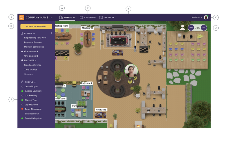
A - As a user, I can clearly see the three main screens representing the primary capabilities of the tool in the header. (See following images. Teamflow currently integrates with Google Calendar, an interface which most users are familiar. It is meant to be I-framed in here. The chat screen design is out of scope but would function similar to slack.)
B - Purple was chosen for the primary color- not only because it was represented in the existing Teamflow logo, but because it makes for a readable background in many shades and would be instantly differentiable from apps with both light and dark colored backgrounds.
C - As a user, I see the "Schedule Meeting" Functionality is the clear CTA on the screen, and it is also repositioned at the top left. This is similar to the main action buttons of creating a meeting and a new email in G-suite products, but also centered at the location in Teamflow where I will be taking the most actions (the left nav) and therefore a more intuitive position.
D - Negative space is removed, and the functionality to switch between offices or companies is added, which will be important for contractors.
E - All colors were checked and now meet WCAG color contrast standards.
F - Calendar functionality is now placed in a position that is intuitive to how frequent office workers check their calendars.
J - Controls to zoom in, zoom out, or manually. type in a view are added- as well as the ability to auto-center your avatar so you can see where you are more easily than on the previously very tiny map.
K - Online or offline status is clearly indicated and functionality to manually set a status is available.
Interacting with coworkers
Previously, navigating to coworkers and around the office was clunky. The added functionality would make it much easier to find a coworker and strike up, or gauge their availability to chat.


L - When I click on a name on the left, I can clearly see that coworker's online status from the bright green stroke around their avatar.
The functionality was added that I can "physically" start talking to my coworker now that I see that he is online, by confirming that I want to go over to him.
This also eliminates the need to manually navigate to my coworker.
M - When I click on my coworkers' avatar, three icons would animate up and around him.
M - When I click the chat icon, I can quickly send an auto message asking him if he's available.
Meetings
Previously, users would start a meeting from the main Teamflow office and use collaboration tools like screen sharing and whiteboarding there. This experience causes information overload due to the busy background overall lack of boundaries. I felt there was a missed opportunity to embrace the concept of "rooms"- which was terminology that Teamflow was already using.
You will notice the simple, yet dimensional background that a user would see after creating a meeting. This gives the feeling of being in a private space that one would need to be invited to attend, without the added noise of things like desks.
G&H - Icons are now visually consistent in treatment in terms of color an line thickness.
I - The terminology "Exit" is used to be clearer in terms of exiting the room that you are in, and when clicked, would return you to the main office.


